 |
| The yellow areas are the spaces covered in this post! |
Our builder’s design center was a Pinterest dream come true. A model home with a beautiful kitchen and gorgeous furnishings, it also had a work space full of every tile and countertop imaginable. I met with the in-house designer, who, as much as I’d like to think I could do this thing on my own, was a valuable sounding board as I brought my visions to life in, oh, about four hours. (Normally, clients take two trips to the design center, but because of our schedule, I had to settle for one.)
 |
| One of the builder's design centers |
Even though I had less than 24 hours to plan for my appointment—I spent pretty much the entire night before lying in bed visualizing my designs—I already had a strong sense of the look I wanted: gray, glam (but not gaudy), with, of course, a white kitchen (think Hollywood Regency meets transitional style). That helped eliminate more than half of the options in design center right off the bat (I rejected anything cream-colored or beige), which made my job a little easier.
We started from the front door and worked our way back. I opted for the builder-grade door—a six-panel mahogany one—but you don’t have to wait long for my first big design moment. It happens literally as soon as you walk inside: Our house has an octagonal, rotunda-style foyer, so to highlight this unique feature, the wood flooring will be laid in a herringbone pattern (with a 12” mitered-edge border). I haven’t met with the lighting specialist yet, but I’m envisioning an orb chandelier hanging overhead, with a pretty foyer table (and fresh flowers!) underneath.
 |
| Herringbone wood floor (my stain is a bit darker) |
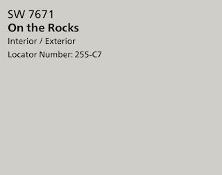
The walls throughout the whole house will be painted Sherwin Williams On the Rocks, with white ceilings (apparently, in Texas, it’s standard to paint ceilings the same color as the walls, so we had to pay a hefty upgrade fee just for white ceilings!).
Next: the kitchen!
 |
| Kitchen inspiration! I'm a sucker for subtle Asian design elements (think pagoda lights and Chippendale chairs), paired with glam finishings. (Photo: Studio-McGee.com) |
This part of the project was high stakes for me. I’ve never had an amazing kitchen—in our first home, a ho-hum 1970s rancher, I refinished the dated oak cabinets and installed granite, but it was more of a “make this work until we move out” scenario. Our current home’s kitchen is pretty, but small—the house was built in the early 1900s when kitchens were strictly functional—and the cabinets are cream-colored, rather than white. So this was my chance to go all out!
For the cabinet doors, I chose...can you guess it...white, with rectangular insets. Then I selected a quartz countertop, Carrara Gioia, that (as the name suggests) looks very similar to Carrara marble but without the maintenance concerns (no staining!).
 |
| Samples of our flooring, backsplash tile, and countertop. |
My husband, ever the engineer, can’t stand the wasted space above cabinets, so we upgraded to ceiling-height, glass-front, upper-upper cabinets, where we’ll store pretty bowls and other things we rarely use but want to display. Sort of like this (but in white):
We also added a decorative vent hood cover over the stove, and chose these legs for the island (they'll be painted white):
To echo the front foyer flooring, we're going with a herringbone backsplash, in matte gray subway tile with white grout. Sort of like this, but lighter:
For the most part, the design center had the materials I’d hoped for—except for brushed gold hardware. So I’m waiting until after the house is finished to install my cabinet handles. I’m still deciding between these options (each only about $6 each at Lowe's):
We’ll have two pendant lights over the island. I’m leaning toward a pagoda-style lantern…sort of like this:
 |
| Lightingconnection.com; $250 |
I’m still deciding on the fixture for the eat-in area next to the kitchen, but I do have a few leading contenders:
 |
| Too much Asian influence with the pagoda lanterns? I still have to decide. |
 |
| I love the style of this, but don't like the $1,000 price tag! |
 |
At $275, this one's much more reasonably priced, but not as beautiful.
|
Next post: the master bath and Asa’s bath!


0 comments:
Post a Comment