Monday, January 11, 2016
Tagged Under: decorating, historic home, inside my home, numbered stairs, painted risers, staircase
Growing up, my house had two staircases, and my parents loved it: My sister and I could access our bedrooms without having to traipse up the front stairs (and make noise that could be heard in the downstairs master bedroom). So when I saw the back staircase in my new house, I was instantly excited, especially since it leads to the kitchen, giving me a direct route to the fridge when the need for a late-night snack strikes (hey, I'm breastfeeding!).
One problem: It's a tight squeeze, since my house was built in the early 1900s, and there's no overhead light. These two factors conspire to make the space feel dark and cramped. In other words, these stairs seemed strictly utilitarian. Definitely not a design destination.
But I loved the idea of having a place for Asa to sit while I cook, once she's a little older. The bottom step fits the bill, so why not make the whole staircase a kid-friendly space? (I feel a little crazy even considering this, since I just recently fell down these very stairs and fractured my sacrum!)
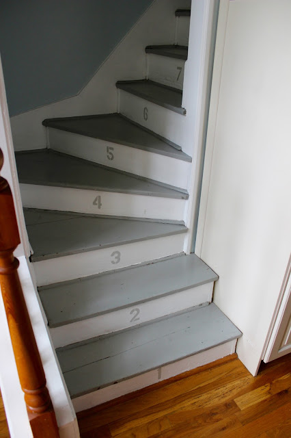
Turning the stairs into a jungle gym is a stretch. But since Asa's room is right at the top of the back stairs, I decided to number them, so she can count the stairs as she walks to her room. I bought a cheap set of Helvetica cardboard stencils from Michael's, painted the cream-colored risers white, and finally, painted the numbers in gray to match the existing color of the treads.
To bring light to the dark stairwell, I painted the walls a light blue, the same color I used in my kitchen.
Then I created a space to display the artwork Asa will someday create. I purchased two backless, glass-less frames from Hobby Lobby (they're often on sale for half off), along with burlap-covered canvases that fit the insides of the frames. I used E-6000 glue to secure the canvases inside the frames, spray-painted clipboard clips gold, and used the same E-6000 glue to adhere them to the canvases. The end result: the perfect place to hang a rotating gallery of Asa originals.
All of this cost me less than $100, and now, my staircase feels like so much more than a pass-through space.
Inside My New House: How I Added Style to My Back Staircase
Share
Growing up, my house had two staircases, and my parents loved it: My sister and I could access our bedrooms without having to traipse up the front stairs (and make noise that could be heard in the downstairs master bedroom). So when I saw the back staircase in my new house, I was instantly excited, especially since it leads to the kitchen, giving me a direct route to the fridge when the need for a late-night snack strikes (hey, I'm breastfeeding!).
One problem: It's a tight squeeze, since my house was built in the early 1900s, and there's no overhead light. These two factors conspire to make the space feel dark and cramped. In other words, these stairs seemed strictly utilitarian. Definitely not a design destination.
But I loved the idea of having a place for Asa to sit while I cook, once she's a little older. The bottom step fits the bill, so why not make the whole staircase a kid-friendly space? (I feel a little crazy even considering this, since I just recently fell down these very stairs and fractured my sacrum!)
Turning the stairs into a jungle gym is a stretch. But since Asa's room is right at the top of the back stairs, I decided to number them, so she can count the stairs as she walks to her room. I bought a cheap set of Helvetica cardboard stencils from Michael's, painted the cream-colored risers white, and finally, painted the numbers in gray to match the existing color of the treads.
To bring light to the dark stairwell, I painted the walls a light blue, the same color I used in my kitchen.
Then I created a space to display the artwork Asa will someday create. I purchased two backless, glass-less frames from Hobby Lobby (they're often on sale for half off), along with burlap-covered canvases that fit the insides of the frames. I used E-6000 glue to secure the canvases inside the frames, spray-painted clipboard clips gold, and used the same E-6000 glue to adhere them to the canvases. The end result: the perfect place to hang a rotating gallery of Asa originals.
All of this cost me less than $100, and now, my staircase feels like so much more than a pass-through space.
Subscribe to:
Post Comments (Atom)


Wow, that's interesting! I'm afraid of steep narrow stairs, but you definitely made them look beautiful! Good job, Laura!
ReplyDelete