Wednesday, May 3, 2017

The Scientific Way to Pick the Perfect Gray Paint

1:40 PM Laura Tedesco


Yes, gray is trendy, and trends change. But my love of gray is not an attraction that’s likely to fade: Way back in the early 2000s, when my best friend and I were aspiring (i.e. 12-year-old) interior designers, we’d often fantasize about painting a dining room gray. Back then, no one had gray walls—everything was that hideous shade of faux-Mediterranean yellow-gold—and even now, more than a decade later, I stand by my preteen design impulse. In my book, gray is always a go, no matter how trendy (or not) it is.

Problem is, as gray has grown in popularity, the number of paints to pick from has proliferated. So how the heck do you choose the right gray for your walls? 

Gray works in every room; the challenge is deciding which shade of gray is best! (Photo: GreigeDesign.com)
Even if you narrow your selections down to one manufacturer—we prefer Sherwin Williams in our house—you still have a litany of options, which all start to blur together (or to look like another color entirely, like lavender or beige). 

The solution: Use science to help you decide.

In researching wall colors for my new home, I came across an interesting (and helpful) concept: light reflectance value (LRV). It’s something listed on the back of paint swatches, which is, admittedly, a place I’ve never bothered to look. The dumbed-down definition of LRV? Basically, it’s how light or dark a color is, a factor determined by how much light the paint absorbs.

(Photo: TheLandofColor.com)

The breakdown: Black absorbs all light, so it marks one end of the LRV scale (0% LRV), and white, which reflects all light, represents the either end (100% LRV). Every shade of gray lands somewhere in between. What that means: If you want a cozy, darker-feeling space, a low LRV paint color is ideal; for a bright and airy vibe, higher LRV is the way to go. 

Here are the LRV values of some bloggers’ and designers’ favorite grays, ranging from light to dark:

Benjamin Moore Horizon

Living room painted with Horizon by Braun + Adams Interiors (Photo: InteriorsbyColor.com)

LRV: 73

Described by Donna Peay, the writer behind the A Perfect Gray blog, as “a beautiful light gray with just a hint of blue,” this shade is certain to brighten up (and cool down) your space.

Benjamin Moore Graytint 

(Photo: KarenHealeyStables.com)
LRV Value: 69

Not too dark, not too light, Graytint is perhaps the definition of an unassuming gray. 

Sherwin Williams First Star

(Photo: VeronikasBlushing.com)

LRV Value: 69


This barely-there gray is the perfect choice for a room in need of a light touch (like the soothing nursery above!).

Sherwin Williams Silverpointe 

(Photo: Houzz.com)
LRV Value: 64

I had this medium gray all over my previous home: in my second and third story hallways and my daughter’s room, where it was paired with Rhinestone (a whitish-gray) for subtly contrasting stripes. 

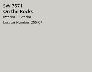
Sherwin Williams On the Rocks

(Photo: houzz.com)
LRV Value: 62

I chose this medium gray for my new home because of its cool undertone (my builder's interior designer described it as having a slightly blue tint), which pairs well with my furniture. 

Sherwin Williams Agreeable Gray

(Photo: houzz.com)
LRV Value: 60

More greige than true gray, this color is an effortless neutral that blends with almost any color palette. It’s used in my builder’s model home. 

Sherwin Williams Silver Strand

(Photo: HouseofTurquoise.com)
LRV Value: 59

A favorite of Joanna Gaines, Silver Strand has just a hint of green to it.

Sherwin Williams Repose Gray

(Photo: Painter1.com)
LRV Value: 59

Another Fixer Upper regular, this beigey-gray is where the scale starts to skew toward the dark side.

Sherwin Williams Mindful Gray

(Photo: HomeBunch.com)
LRV: 48

Think of this as the darker cousin of Repose Gray (Jo-Jo has been known to use both!). As Thistlewood Farms blogger KariAnne Wood describes it: “This is the gray that trumps all others when you just don’t know where to turn. It’s the perfect not-too-green-not-too-pink gray." 

Sherwin Williams Dorian Gray

(Photo: kylieminteriors.ca)
LRV: 39

This gray is on the darker side of medium, with a slightly greige undertone.

Benjamin Moore Dior Gray

(Photo: homebunch.com)
LRV: 22

Interior designer—and Oprah favorite—Nate Berkus has called this dark gray his fail-safe shade, for its elegance and classic appeal.   

Farrow & Ball Down Pipe

(Photo: moderncountrystyle.blogspot.com)
LRV: 13

Farrow & Ball describes this shade as a “dark lead gray” with blue undertones. Perfect for a moody library.

Benjamin Moore Cheating Heart

(Photo: caitlinwilsondesign)
LRV: 9

This charcoal gray will make a bold statement on your walls or help draw the eye to little details, like the legs of a clawfoot tub, as designer Jen Going suggests. 


Tuesday, April 25, 2017

Destination Dallas: Our First Homebuilding Debacle

12:59 PM Laura Tedesco
Oh, almond windows, how I loathe thee. 
I suppose it was bound to happen. 

For weeks, I’ve been obsessively pondering every square inch of our new home (while "watching" Beauty and the Beast, I was actually mulling over my foyer flooring). But it wasn’t until this weekend that I noticed a single word, buried in the contract, that sent me reeling: almond.

I was flipping through the thick document, trying to find the dimensions of the living room windows so I could start thinking about curtains, when I spotted it. Somehow, I'd missed it before: Our windows are not white, but rather almond (or, as the builder calls it, “sandstone”). Panic quickly ensued. 

Our paint color on the left, window frame on the right.
(The paint color is grayer in reality than it looks here.)
One room in our current house, the sunroom, has cream-colored window frames, and before we found out we were moving, I devoted a lot of time and mental space to figuring out how to disguise them, replace them, or paint them. Now I’m going to have not just off-white—but sand-colored—window frames in EVERY ROOM OF MY HOUSE. 

The sunroom of my current house, in all its cream-colored window glory.
Our builder and designer discussed with us every other detail of the home—whether the front door, the door knobs, the flooring, the outlets—but for some reason neglected to mention the almond window frames. My builder's explanation: Everyone in Texas now uses them—they’re designed to blend with the earthy-colored exteriors—so they don’t even consider it worth discussing. That leaves me to add “non-white windows” to my list of Texas real-estate oddities, alongside (mostly) non-white ceilings and textured walls. 

In the model home, the beige windows do seem to blend, even with gray walls,
so maybe I'm being overdramatic? Only time will tell!

Unfortunately, by the time I noticed, the windows had already been installed, and we’re not about to fork over thousands of dollars to change them (according to the builder, they’d just have to be trashed or donated to Habitat for Humanity). My last hope is that they can be painted; we’re waiting to find out if doing so will void the warranty. Otherwise, I’m just going to have to rely heavily on curtains, blinds, and shutters. This is where I would insert a sad face if I used emojis, although my sister has been one source of solace, offering her own home-decorating crisis as a lesson. 

When she installed bamboo blinds, she fretted for weeks over the long cords dangling in front of her windows, and beat herself up for not spending a little more money for the cordless version. But eventually, she stopped noticing the cords entirely—and suspects I’ll do the same. So here’s hoping that my ugly windows eventually “disappear”—even if they can’t physically be replaced—and in the meantime, I’ll file this away as a lesson for the future: Don’t ever assume anything when building a house.  

Friday, April 21, 2017

Destination Dallas: Designing My Dream Home (Part 1)

1:50 PM Laura Tedesco


The yellow areas are the spaces covered in this post!
Our builder’s design center was a Pinterest dream come true. A model home with a beautiful kitchen and gorgeous furnishings, it also had a work space full of every tile and countertop imaginable. I met with the in-house designer, who, as much as I’d like to think I could do this thing on my own, was a valuable sounding board as I brought my visions to life in, oh, about four hours. (Normally, clients take two trips to the design center, but because of our schedule, I had to settle for one.) 


One of the builder's design centers
Even though I had less than 24 hours to plan for my appointment—I spent pretty much the entire night before lying in bed visualizing my designs—I already had a strong sense of the look I wanted: gray, glam (but not gaudy), with, of course, a white kitchen (think Hollywood Regency meets transitional style). That helped eliminate more than half of the options in design center right off the bat (I rejected anything cream-colored or beige), which made my job a little easier. 

We started from the front door and worked our way back. I opted for the builder-grade door—a six-panel mahogany one—but you don’t have to wait long for my first big design moment. It happens literally as soon as you walk inside: Our house has an octagonal, rotunda-style foyer, so to highlight this unique feature, the wood flooring will be laid in a herringbone pattern (with a 12” mitered-edge border). I haven’t met with the lighting specialist yet, but I’m envisioning an orb chandelier hanging overhead, with a pretty foyer table (and fresh flowers!) underneath.  


Herringbone wood floor (my stain is a bit darker)
The walls throughout the whole house will be painted Sherwin Williams On the Rocks, with white ceilings (apparently, in Texas, it’s standard to paint ceilings the same color as the walls, so we had to pay a hefty upgrade fee just for white ceilings!). 


Next: the kitchen! 


Kitchen inspiration! I'm a sucker for subtle Asian design elements (think pagoda lights and Chippendale chairs), paired with glam finishings. (Photo: Studio-McGee.com)
This part of the project was high stakes for me. I’ve never had an amazing kitchen—in our first home, a ho-hum 1970s rancher, I refinished the dated oak cabinets and installed granite, but it was more of a “make this work until we move out” scenario. Our current home’s kitchen is pretty, but small—the house was built in the early 1900s when kitchens were strictly functional—and the cabinets are cream-colored, rather than white. So this was my chance to go all out! 

For the cabinet doors, I chose...can you guess it...white, with rectangular insets. Then I selected a quartz countertop, Carrara Gioia, that (as the name suggests) looks very similar to Carrara marble but without the maintenance concerns (no staining!). 

Samples of our flooring, backsplash tile, and countertop.
My husband, ever the engineer, can’t stand the wasted space above cabinets, so we upgraded to ceiling-height, glass-front, upper-upper cabinets, where we’ll store pretty bowls and other things we rarely use but want to display. Sort of like this (but in white):

Photo: http://miss-dixie.blogspot.com/2013/07/my-subway-tile-obsession.html

We also added a decorative vent hood cover over the stove, and chose these legs for the island (they'll be painted white):


To echo the front foyer flooring, we're going with a herringbone backsplash, in matte gray subway tile with white grout. Sort of like this, but lighter:

Photo: HouseofTurquoise.com

For the most part, the design center had the materials I’d hoped for—except for brushed gold hardware. So I’m waiting until after the house is finished to install my cabinet handles. I’m still deciding between these options (each only about $6 each at Lowe's):


We’ll have two pendant lights over the island. I’m leaning toward a pagoda-style lantern…sort of like this: 

Lightingconnection.com; $250
I’m still deciding on the fixture for the eat-in area next to the kitchen, but I do have a few leading contenders:

Too much Asian influence with the pagoda lanterns? I still have to decide.

I love the style of this, but don't like the $1,000 price tag! 

At $275, this one's much more reasonably priced, but not as beautiful.

Next post: the master bath and Asa’s bath! 

Thursday, April 20, 2017

Destination Dallas: House Hunting!

3:58 PM Laura Tedesco
A rancher shouldn't be that pricey, right? Nope: This white-brick Dallas beauty was $750K.
Talk about a real-estate wake-up call.
I never thought I’d be a Texan—I don’t like crazy-hot weather, flat land, or McMansions, which were pretty much the only things I knew about Texas a few months ago. I don't even particularly care for shiplap. But then Frank got offered a job we simply couldn’t pass up, so here we are, on our way to the Lone Star state.

Beautiful Fort Worth bungalow, with a not-so-stunning neighborhood.
His office is just outside of Dallas, so I initially focused my search on historic homes in Dallas or Fort Worth. After living in a 100-year-old home with close proximity to a downtown—albeit a one-street downtown—I was determined to replicate the lifestyle I love in the big city. But on our first house-hunting trip, I came back to Maryland discouraged: Every old home I looked at, no matter how tastefully done, was smack dab in the middle of a bad neighborhood. With a toddler in tow, that wasn’t going to work—so I did what I said I’d never do: shifted my search to the suburbs. 

I had a lengthy list of must-haves: a white kitchen, four bedrooms, a fenced yard, a short drive to amenities and Frank’s office, and a good-sized garage. (Basically, everything the unreasonable buyers on House Hunters demand!)  After weeks of scouring Zillow, I wasn’t feeling optimistic. Despite what everyone says about Texas real estate (“You can get so much house for your money!”), the homes were high-priced and short on style: a whole lot of brick behemoths, with hyper-vaulted ceilings (which I hate), tile living rooms, and textured walls. I couldn’t fathom spending so much money on so ugly a house.

I don't want to house-shame any of the actual properties we perused. So here's a nice visual summary of Texas living. (Photo: McMansion Hell)
With so little inventory I actually liked, I sent my poor realtor a list of 31 homes—all of which we needed to see in one weekend. I figured if I saw enough of ‘em, one was bound to stick. And one did…but unbeknownst to us, the owners were already in talks with another buyer. I woke up Sunday morning prepared to make an offer after walking through the house a second time—and as I stood in the home’s foyer, my realtor informed me the place was already under contract. It’s no wonder I developed shingles that weekend. The stress was awful!

I trudged through the remaining homes on my list, and every last one fell short. Doggy stench, outdated kitchens, vaulted foyers—they all seemed to be reminding me that I’d lost the only house I could love in the entire DFW metro-area. But then my realtor suggested meeting with builders, an idea I’d resisted, since I didn’t wanted a postage-stamp yard or a treeless neighborhood. 

The first builder was a flop: The houses were already framed, which meant it was too late to select my own finishings—and the salesman couldn't show me what, exactly, had been selected for the home. I wasn’t willing to buy a house without seeing what it would look like. Pass.

The second builder was a totally different story. I was told I could pick everything—from the countertops to the flooring to the faucets, and I knew this was a good fit. We walked around a few framed-out two-story homes, but they all had vaulted living rooms and corner fireplaces—total turn-offs to me. The salesperson mentioned they had one single-story home in the works with cathedral ceilings (A-shaped, instead of vaulted). We currently live in a three-story home, and I’ve fallen down nearly every set of stairs. So I liked the idea.

Exterior rendering of our new home

Long story short, we fell in love with the home (well, the floor plan—the foundation hadn’t even been poured) and rescheduled our flights so I could spend the next day in the design center choosing all of my finishes. Although I’d never suggest doing this in a few hours—talk about stress!—it was also a blast. And I got to choose all the little details I’ve dreamed about—hex tiles, white kitchen cabinets, herringbone wood flooring. But more on that next time!

Monday, April 10, 2017

From FDR to Trump: How the Oval Office Decor Has Changed

2:45 PM Laura Tedesco
President Obama's office on the left, President Trump's on the right. (Photo: Getty/Facebook)
Donald Trump is breaking pretty much every Presidential precedent, but in one way, at least, he's like (almost) all the others: He's owning the Oval Office, redecorating it within days of moving into the White House. 

But for a man who never does anything modestly, his Oval House makeover is, so far, surprisingly l0w-key: Trump has kept President Obama's striped wallpaper (it's gold, so that may explain why he's allowed it to stay), and simply swapped out the furniture and curtains (he ditched Obama's crimson ones for, wait for it, gold ones). He did choose a flashier rug, with a sunburst-like design around the Presidential seal, but it's not actually new: It was originally used during the Reagan era (and briefly in the Bush Oval Office).


Photo: Getty/Facebook

Perhaps Melania made the choices? 

Historically, the Oval Office decor has been more a reflection of the First Lady's taste than the President's: Typically, shortly after the inauguration, the new woman of the White House swoops in to make the interior her own (and stake her husband's claim on the place). As a study in the Journal of Interior Design explains, "the [First Lady's] role in overseeing the decor is often cast as preserving history. However, the room is often actually redecorated for aesthetic purposes or to communicate a new message and not because the room is worn or out of style." 


This trend started with perhaps the chicest First Lady in U.S. history: Jackie O. In fact, JFK's Oval Office decorating scheme changed twice—the second time over the weekend he was assassinated. Jacqueline Onassis brought in a celebrity decorator, which set the precedent for Nancy Reagan, Barbara Bush, and Michelle Obama to do the same. 

That said, the Oval Office has been evolving since the 1930s, starting with FDR, according to the Journal of Interior Design study (from which these photos and facts were culled).


Franklin Delano Roosevelt (1934-1945)
Designer: Eric Gugler (architect)


FDR was the first president to occupy the present-day Oval Office. In 1929, the West Wing went up in flames, and FDR's predecessor President Hoover opted to rebuild it exactly as it before. But Roosevelt decided to move the Oval Office to a location with more light and easier access to the residential wing of the White House.

But it was his wife who did the decorating. Eleanor Roosevelt made the new office a little larger (two feet longer and two feet wider) and recruited architect Eric Gugler to design the space, which was inspired by FDR's passion for Georgian architecture. Why the dramatic drapes? The U.S. was in the midst of economic uncertainty, so the President's office needed to convey a strong sense of leadership. The solution: eagle emblems! 


Harry Truman (1945-1953) - Dwight D. Eisenhower (1953-1961)
Designer (Truman era): Charles T. Haight (architect)


Truman lightened things up, trading the dark green of FDR's scheme for a paler green palette. First Lady Elizabeth Truman worked with architect Charles Haight to install the new curtains and rug, later used by Eisenhower, Kennedy (early in his term), and Johnson. In fact, Eisenhower was one of the few 20th-century presidents who didn't redecorate at all. He stuck with the look at the Truman's wife had installed. 

Truman didn't stop with drapes and carpeting: He also outfitted the Oval Office with televisions and new furniture, designed to make him look like a modern president.

John F. Kennedy (1961-1963)
Designer: Sister Parish and Stephane Boudin


At the beginning of his presidency, JFK kept FDR's blue-green rug and drapes. But on the weekend he was killed, he had a red rug installed, a choice that disturbed subsequent president Johnson, since it reminded him of the assassination. 

Jackie Kennedy was the first of the first ladies to choose a celebrity decorator: Sister Parish, a socialite and interior designer known for her country house style (and said, at the time, to be the most famous decorator). 

Lyndon B. Johnson (1963-1969)
Designer: None


At first, Johnson kept Kennedy's red rug, but later reverted to FDR's blue-green carpet, paired with Kennedy's pale curtains. He removed the Resolute Desk, a gift from Queen Victoria during President Hayes' tenure, only because it was too small for his 6-foot-3.5-inch frame. 

Richard Nixon (1969-1974)
Designer: Sarah Doyle Jackson


Would you expect anything other than gold curtains from the first president of the 1970s? 

Gerald Ford (1974-1977) and Jimmy Carter (1977-1981)
Designer (Ford era): Clem Conger (curator) and Edward Jones (architect)
Designer (Carter era): Carleton Varney


Ford installed pumpkin-colored drapes, gold curtains, and a pale gold rug with blue florettes, in an effort to create a "warmer" feeling, after the tumult of Nixon, a decor scheme that Jimmy Carter chose to keep. Ford was the only president who abandoned the presidential emblem altogether, and he did way with all of the room's eagles, except the plaster one on the ceiling. 

Ronald Reagan (1981-1989)
Designer: Ted Graber


During his first term, Ronald Reagan kept the Ford-era decor. But for his second term, he spiced things up with this pale yellow rug with a sunbeam design, made by Stark Carpet Co. at a cost of $49,625. 

George H.W. Bush (1989-1993)
Designer: Mark Hampton


After years of yellow-and-orange decor, the first Bush president redecorated with cool tones: He installed a light blue rug, at a cost of $28,500, along with light blue drapes. The color scheme was a nod to Bush's alma mater, Yale. 

Bill Clinton (1993-2001)
Designer: Mark Hampton


In a throwback to the Ford era, Clinton opted for yellow drapes and a royal blue rug, a prescient choice considering the color of his mistress's famous dress.

George W. Bush (2001-2009)
Designer: Kenneth Blasingame


George W. Bush kept it classy with neutrals and splashes of blue. Although this sunbeam rug, a symbol of optimism, is similar to the one from the Reagan era, it was actually new; in fact, he removed Clinton's rug on his first day of office, a not-so-subtle promise that his presidency would be different from his predecessor's. The cost of his new rug? $61,000. 

Barack Obama (2009-2015)
Designer: Michael Smith


Even President Obama's Oval Office was in keeping with his agenda: He and the First Lady wanted an eco-friendly design, which is why they chose a rug made of recycled wool (with several quotes from powerful historical U.S. figures woven into the border). As a nod to Michelle Obama's anti-obesity platform, the flower arrangement on the coffee table was replaced with a bowl of red apples.

Although the Obamas chose a well-known decorator, Michael Smith, they waited until late 2010 to make some of the changes, since the economy was suffering when Obama took office. As the study authors note, "The Obamas and Smith selected elements carefully; choosing the new decor that intentionally branded America's first African American president as a modern style-conscios leader without significant cost to the public." 

The office isn't without some elaborate elements though: For the first time in history, the walls were adorned with a hand-painted wall covering, rather than simply being painted.

Thursday, September 8, 2016

How to Set the Table for a Tea Party

2:27 PM Laura Tedesco

My daughter isn’t old enough to be trusted with a tea cup (full or empty), but I love the idea of a tea-party themed birthday party for an older girl. In fact, my niece, who just started third grade, recently had one with her friends—and I thought it was the perfect, frilly way to let little girls feel grown-up. And really, does anyone really need an excuse to sip on tea and eat dainty pastries? 

Mix & Match Your Dishes

It’s no biggie if you don’t have a full set of girly-looking dishes—you can mix and match, like I did. I chose my favorite vintage plates—Hazel Atlas Pink Crinoline—for their wavy edges and pretty pink detailing, and paired them with gold chargers (an Aldi score!) and a floral sugar bowl that a family member passed down to me. A mix of new, vintage, and antique is totally fine—as long as they all have delicate features to tie them together.


Think Outside the Tea Cup

I don’t happen to have half a dozen tea cups sitting around—but I do have a set of clear glass mugs from the 1950s with cute handles. If you don’t have something similar, check out your local thrift store, and you’ll undoubtedly find mismatched tea cups (the more patterns, the better!) or a set of mini mugs like mine. (You can also find teapots at thrift shops; in fact, I just snagged a vintage Tiffany & Co. teapot for $10 the other day.)


Go Wild with Flowers

For a girly party, you can never have enough flowers, which is why I assembled two arrangements for the table. Hint: If you want to reuse your flowers, try my trick: Buy high-quality silk stems, then mingle in a few real sprigs of baby’s breath. Trust me, no one will know the difference (unless a partygoer leans in to take a whiff, which has happened to me!). In keeping with the party’s theme, I used an antique tea kettle as a vase.


Decorate with Napkins

Napkin rings are nice, but I prefer to use pretty cloth napkins to accent my plates. I have a set of vintage napkins with pink embroidery along the edges, which I folded into triangles and placed under the tea plates. This keeps your table looking tidy, while also adding visual interest. 

Play with Metals


Gone are the days of one metal per room, so feel free to add some bling to your table with a mix of shiny stuff. For example, I used a sterling silver tea kettle, brushed gold silverware (from One Kings Lane), and a bronze tray for the sugar cup. This approach adds visual variety to your table and helps you avoid ripped-straight-from-Pier-1 matchy-matchiness.